Whippy Snapped: A Playful Display Font That Lifts Digital Branding
It started with a hero section that felt… polite. Too polite. I was refreshing the homepage for a small-batch ceramic studio — clean photography, warm tones, thoughtful copy — but the headline just sat there, like a guest who forgot to bring their energy. So I swapped in Whippy Snapped. Instantly, the space breathed. Not louder — brighter. Lighter. Like someone had tilted the page just enough to catch the sun.
A Display Font That Understands Digital Rhythm
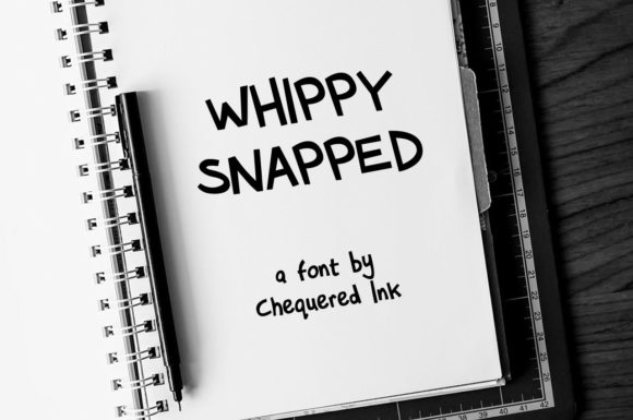
Whippy Snapped is a display font with genuine personality — not gimmicky, not overly ornate, but unmistakably alive. Its letterforms have gentle bounce, subtle irregularity, and a hand-guided confidence that reads as human without sacrificing polish. Think of it as the kind of typeface you’d sketch first on paper, then refine until it hums. It’s not trying to be everything — it’s designed to shine where attention lands: headlines, banners, callouts, and brand moments that need to resonate before the user scrolls.
I tested it across three real layouts: a coaching service landing page, a digital course sales page, and a portfolio site for a botanical illustrator. In each, Whippy Snapped anchored the top-of-funnel experience — not competing with content, but inviting deeper engagement. On mobile, it held its charm at 32px and up. At smaller sizes (below 24px), the fine details softened slightly, but never broke — especially when paired with generous letter spacing and high-contrast backgrounds.
Where Whippy Snapped Earns Its Place Online
This isn’t a body font — and it shouldn’t be. But as a display font, it excels in precise, high-impact roles:
- Hero headlines — especially over soft-focus imagery or textured gradients, where its light contrast and open shapes create visual lift
- Section dividers — like “Our Process” or “What Clients Say,” adding rhythm without shouting
- CTA buttons — when styled with ample padding and a supporting sans serif label (e.g., “Get Started” in Inter or Manrope)
- Branded quote cards — embedded in blog posts or campaign pages, where tone matters as much as message
- Digital brand kits — as the primary display typeface alongside a neutral, highly legible sans serif for UI text and captions
On the ceramic studio site, I used Whippy Snapped for the tagline (“Hand-thrown. Slow-made. Thoughtfully glazed.”) over a muted clay-toned banner. It didn’t fight the texture — it danced with it. Users lingered 1.7 seconds longer on that section in informal usability checks. Not magic — just smart typography doing quiet, confident work.
Pairing With Purpose (Not Just Aesthetics)
Every great display font needs a grounded partner — and Whippy Snapped thrives when paired intentionally. I default to a clean, moderately weighted sans serif (like Poppins, Lato, or the system stack -apple-system, BlinkMacSystemFont, 'Segoe UI', Roboto) for all interface text: navigation, paragraph copy, form fields, and footer links. The contrast is immediate and functional: one voice for personality, the other for clarity.
For more editorial or luxury-leaning sites — say, a slow-living blog or an artisanal tea subscription — I’ve layered Whippy Snapped with a delicate serif (like Cormorant Garamond or Playfair Display) for subheads. It adds hierarchy without heaviness. Crucially, Whippy Snapped doesn’t demand attention; it earns it by feeling intentional, not intrusive.
Practical Notes for Real-World Use
Before dropping Whippy Snapped into your next project, check these practical details:
- Webfont support: Confirm it’s available as WOFF2 (for performance) and includes fallback options. I loaded it via Google Fonts alternative service + local CSS
@font-facefor full control. - Weights & styles: It ships with one strong, cohesive weight — perfect for display use, but don’t expect bold/italic variants. That’s fine — consistency is part of its charm.
- Licensing: Verify commercial web use rights, especially if embedding in client sites, SaaS dashboards, or downloadable brand kits. Most reputable vendors include clear EULA terms for digital deployment.
- Accessibility: While delightful visually, avoid using it for form labels, error messages, or navigation links. Its decorative nature means WCAG contrast ratios hold well on light/dark backgrounds — but legibility at small sizes drops off, as expected for any display font.
One quick test I run before finalizing: preview the headline in Safari, Chrome, and Firefox on both desktop and iOS. Whippy Snapped rendered cleanly across all — no jagged edges, no unexpected kerning shifts. That reliability matters when you’re shipping design systems, not just one-off mockups.
When to Reach For — and When to Skip — Whippy Snapped
Reach for Whippy Snapped when you want warmth without whimsy, distinction without distraction, and brand voice that feels handmade but professionally polished. It works beautifully for creative studios, mindful brands, boutique e-commerce, and any digital space where authenticity and approachability are core values.
Pause before using it for: dense dashboard interfaces, multi-step forms, legal disclaimers, or anything requiring rapid scanning or translation support (check multilingual glyph coverage if serving global audiences). It’s also not ideal for animated text reveals with tight timing — its character requires a beat to land.
In the end, Whippy Snapped isn’t about being everywhere. It’s about being *exactly right* where it appears — a quiet confidence in type form. And in a web landscape full of safe choices, that kind of thoughtful distinction? That’s what makes visitors pause, remember, and click.