Flyover: A Modern Display Font for Digital Branding
As a UI designer who builds landing pages, SaaS dashboards, and e-commerce experiences, I look for fonts that do more than look good—they need to reinforce tone, guide attention, and scale cleanly across devices. Flyover stands out in the freebies category not because it’s “trendy,” but because it’s intentionally crafted for digital impact: sharp angles, confident spacing, and a rhythm that reads instantly—even at smaller sizes on high-DPI screens.
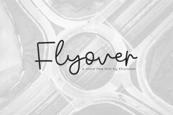
Flyover is a geometric display font with subtle flair: clean terminals, balanced x-height, and just enough character to avoid feeling sterile. It’s not a script or handwritten font—it doesn’t pretend to be organic. Instead, it leans into modern typography with precision. That makes it ideal for contexts where clarity meets personality: hero headlines, product name tags, CTA buttons, and brand lockups in web interfaces.
Where Flyover Performs Best in Web Layouts
In real-world web design, Flyover shines most as a primary display typeface—not body copy. Think of it as your visual anchor: the first thing users see when they land on a page. On a coaching website, it works powerfully in the hero section (“Transform Your Workflow”) over a muted gradient background. In an online boutique, it adds polish to category banners (“New Arrivals”) without competing with product imagery. For a course sales page, pairing Flyover with a neutral sans serif (like Inter or Manrope) creates clear hierarchy: Flyover sets the emotional hook; the supporting font delivers the details.
It’s especially effective in conversion-focused layouts. Because of its strong letterforms and open counters, Flyover remains legible even at 32px on mobile—critical for thumb-scrolling users. On dark mode interfaces, it maintains contrast without harsh glare. Over semi-transparent image overlays? Its weight distribution prevents visual “muddying.” Just avoid using it below 24px for body text or long paragraphs—it’s not designed for extended reading.
Readability & Responsiveness in Practice
Flyover includes a single weight (Regular), delivered as OTF and WOFF2 files—so it’s web-ready with minimal setup. No variable axis, no italic alternate—but that’s intentional. Its strength lies in consistency, not complexity. For responsive use, I recommend setting it via @font-face with fallbacks, and applying it only to headings (h1–h3) and short, high-impact elements like feature cards or testimonial quotes.
On mobile, I cap Flyover usage at 40px max for headlines and always test line height: 1.2 works well for tight vertical rhythm. For buttons, I use it at 18–20px with generous letter-spacing (0.5px) to preserve legibility on small taps. Never stretch or distort it—its geometry depends on native proportions. And if you’re layering it over photography, add a subtle text shadow (1px black at 30% opacity) for guaranteed readability on light or busy backgrounds.
Strategic Font Pairing for Digital Identity
Flyover isn’t meant to go solo. Its role is to elevate—not explain. That’s why pairing matters. For web interfaces rooted in clarity (SaaS tools, analytics dashboards), pair Flyover with a highly legible, low-contrast sans serif like Inter or IBM Plex Sans. The contrast between Flyover’s assertive geometry and the neutrality of the body font reinforces hierarchy without visual fatigue.
For editorial or creative brand sites—think design blogs, portfolio platforms, or independent publishers—a restrained serif like Playfair Display (light or regular) can complement Flyover beautifully. Use Flyover for section titles (“Case Studies”, “Process”) and Playfair for article headers and pull quotes. This combination signals sophistication while keeping navigation scannable.
Avoid pairing Flyover with other decorative fonts, condensed sans serifs, or anything with competing stroke modulation. It needs breathing room—and a calm partner—to do its job.
Using Flyover Across Digital Touchpoints
Beyond websites, Flyover scales meaningfully across digital assets. In Figma or Framer prototypes, it communicates brand confidence before a single interaction happens. As logo text for a startup or micro-SaaS, it conveys forward motion—literally in the name, figuratively in its uplifted terminals. For social media graphics (LinkedIn carousels, Instagram story highlights), it holds up at thumbnail size better than many script fonts.
I’ve used Flyover in client work for: a wellness app’s onboarding flow (headline + subhead only), a print-on-demand store’s homepage banner (“Handcrafted. Limited.”), and a digital brand kit where it anchors the primary logo, favicon treatment, and email header. Each time, the font reinforced a sense of intention—not flashiness.
Licensing & Real-World Usage Notes
Flyover is offered as a freebie, but always verify the license before deployment. Most free fonts allow personal and commercial use—including client websites, online stores, and digital templates—as long as attribution isn’t required and redistribution is prohibited. That means you can embed Flyover in a Shopify theme you sell, use it in a Notion template for coaches, or ship it with a Figma UI kit—provided the license permits derivative works and webfont embedding.
What it doesn’t include: multilingual glyphs beyond basic Latin (no Cyrillic, Greek, or extended diacritics), bold or italic variants, or OpenType features like ligatures or stylistic alternates. So if your project targets global audiences or requires typographic nuance, plan accordingly—or treat Flyover as your headline-only asset within a broader type system.
Ultimately, Flyover earns its place in my font library because it solves a specific digital problem: how to signal modernity and clarity without sacrificing warmth. It’s not a replacement for a robust type system—but it’s the right accent, at the right moment, for brands that want their web presence to feel both grounded and aspirational.